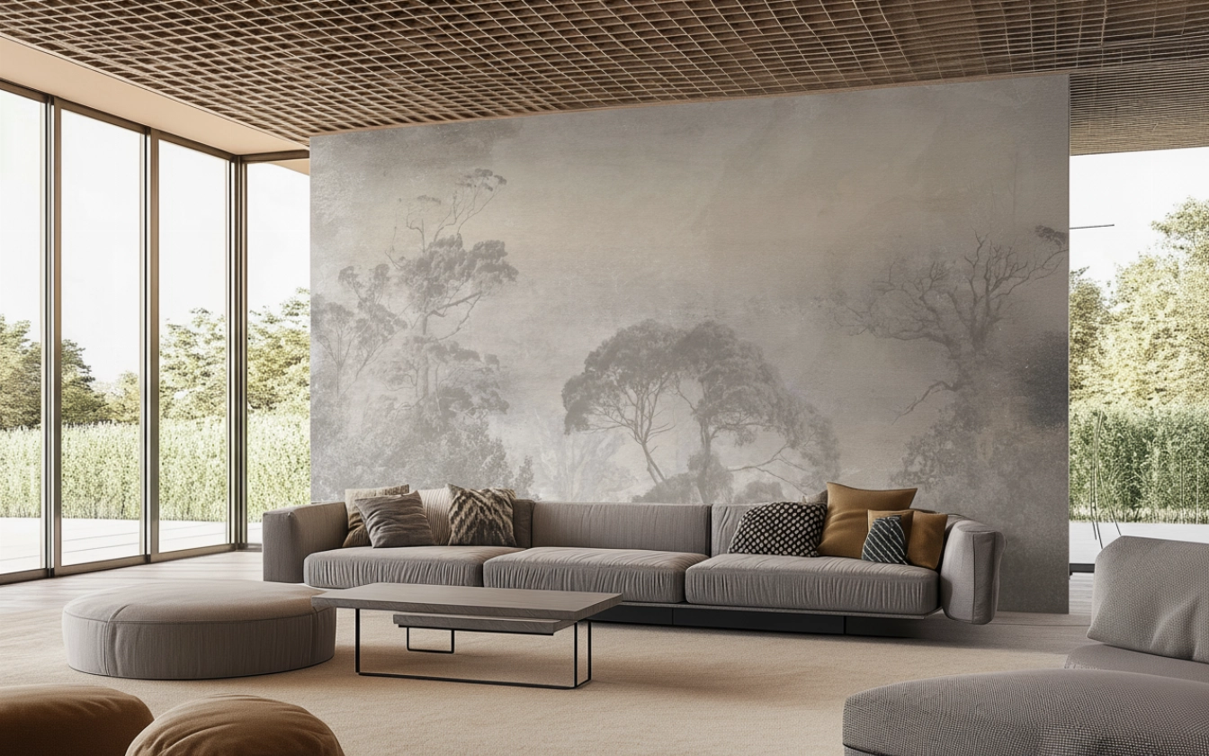
| Scandinavian | Landscape
R-Design Luvena MRL100
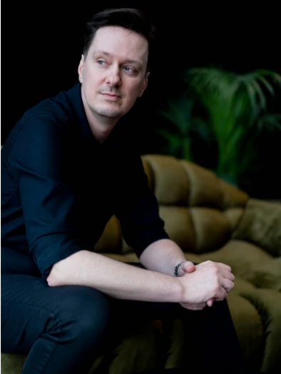
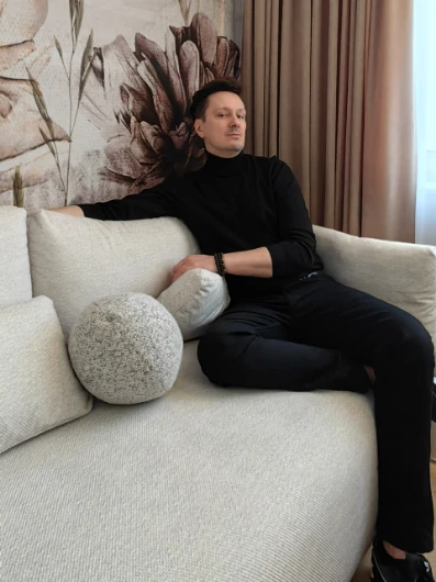
Collection: Marcin Runowiecki R-Design
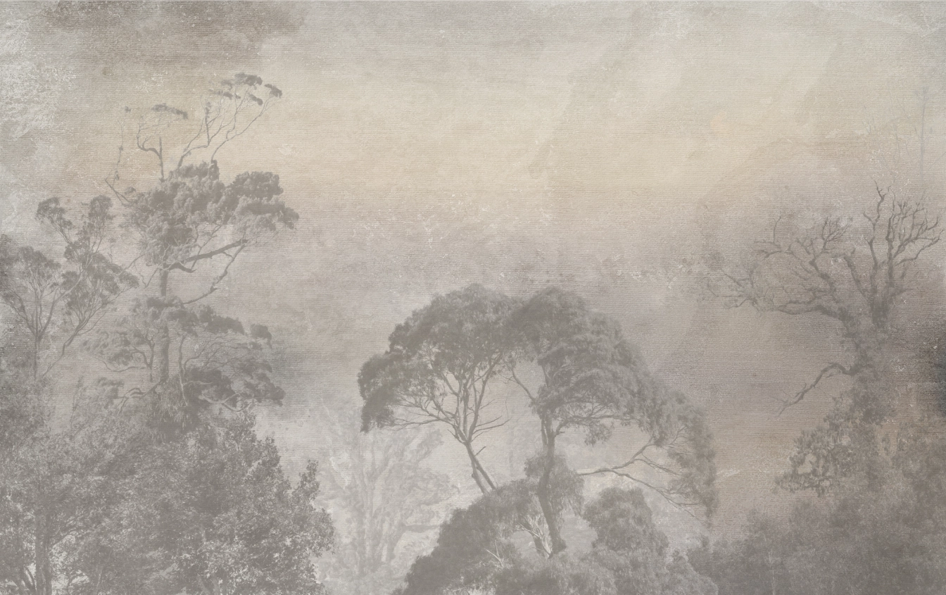
The misty landscape of the forest unfolds in soft grays and beiges, as if filtered by the morning light. The layered silhouettes of trees merge with the canvas texture, creating a calm, soothing depth. The gentle transitions of tones leave plenty of space and breathing room, not overwhelming the interior. A subtle patina adds a touch of natural elegance and harmony to the composition. The wallpaper will complement bright, minimalist arrangements perfectly, introducing an atmosphere of silence and Scandinavian tranquility.
Customize the graphics perfectly to your space - change the dimensions, saturation, and color, enlarge or rotate according to your own vision. Download a preview with a valuation, order a sample, or buy the selected graphic immediately to enjoy a perfect fit for your interior.
Marcin Runowiecki R-Design
Special Collection
Interior design is my natural language.
For years, I have been designing interiors that are not only functional, but also welcoming. Spaces where one can find oneself and unwind. It all starts with proportions, light, and material. They build the atmosphere.
I'm not looking for an effect - I'm looking for harmony. The interiors I design have their own pace, rhythm, and tone. They do not overwhelm. They are grounded, free, and refined.
Out of the need to expand this language into something more personal, the collection of original graphics and murals was born. It was not a plan or a strategy. It was a natural step - a further continuation of the conversation about space.
Graphics and murals have become an independent chapter of my work. They are not decorations. Not accessories. I treat them as interior elements - equal to furniture, wall structure, or light. Their role is not to stand out. They are meant to be present, yet unobtrusive. To work in the background, but with character.
I focus on balanced composition: color, texture, and form always function together. Patterns are created to harmonize with the interior - not compete with it. They are an invitation to peace. To breathe. To silence, where one can feel good.
Inspirations come slowly.
Most often from seemingly insignificant things - a piece of leaf stuck to the window, the play of light on the wall on a cloudy day, a reflection in the water that lasted a second. They are quiet, sometimes almost imperceptible. But it is from such details that the mood is born.
What is found in this collection is not a description of reality - rather an echo of moments. It is a record of emotions, rhythm, structure. Shapes that are not always easy to name.
Sometimes they are references to plants - not directly, more as an impression. Other times - natural veining in stone, water movement, or a shifting shadow. There is a lot of intuition, softness, natural implications in this collection.
I think abstractly and emotionally. I don't copy nature - I extract from it what moves me: space, movement, fluidity. I'm not looking for literalness or symmetry. I like moments where something blurs, shifts, doesn't end.
What is most precious is often on the edge of what is visible.
Graphics and murals are created in the rhythm of design work - as its extension. Always with the interiors they will inhabit in mind. They are like a soft layer - complementing proportions, emphasizing color palettes, completing the architecture of light.
I aim for these patterns to allow space to breathe.
To be a background that doesn't fade away - but also doesn't scream.
Our foundations

CANVAS - vinyl wallpaper with a non-woven backing. The structure resembles a painter's canvas. The wallpaper on this backing gives a three-dimensional impression, and the structure makes it look like a painted picture. A material of the highest quality, durable and resistant to scratches.
grammage 350g/m2
fire resistance C-s2, d0
maximum width of the roll 1m
mounting system: butt joint / double cut
Sample graphic
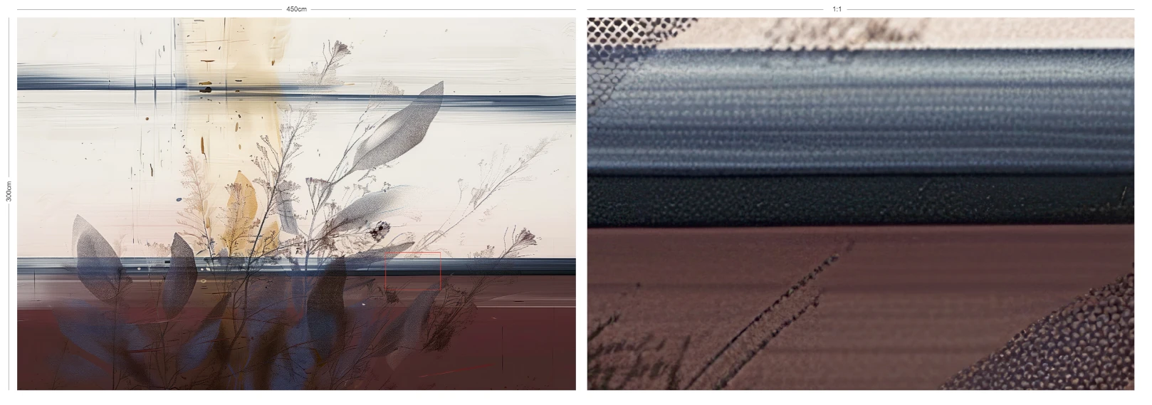
The sample consists of two complementary presentations: a miniaturized version of the entire graphic, which allows you to see the layout, proportions, and composition of the pattern, and a 1:1 scale slice - exactly in the enlargement in which the fragment will be visible on the wall after printing. Thanks to this, the customer gains both a full view of the project and a real reference to the color, detail, and character of the print.
Ordering a sample particularly helps to reduce the risk of color differences resulting from various settings of computer screens, phones, or tablets, which can present colors in a different way. The sample provides certainty that the final effect will meet expectations - both in terms of shade and print quality.
It is encouraged to order a sample before placing the final order. This facilitates further communication and verification of the effect, and in case of any doubts, speeds up their clarification. It should be noted that in situations where the only reason for discrepancies is differences in color display on screens, the lack of a previously ordered sample may limit the possibility of a positive consideration of the claim.
Assembly instructions
All REVE graphics are prepared for standard flush mounting, allowing for a seamless and elegant surface without visible joints.
If, however, there is a need to mount on a tab (e.g. due to technical requirements or the interior's specificity), it is also possible - just inform us at the ordering stage so that the graphics can be prepared accordingly.
More detailed information regarding the preparation of the substrate and the assembly itself can be found in the REVE assembly instructions.
Dedicated PARA Paints:
Subscribe to the newsletter
Receive exclusive email updates about new products and interior design inspirations.