What wallpaper patterns enlarge the room
What wallpaper patterns enlarge a room
Arranging small spaces is one of the most common challenges in contemporary interior design. In the era of shrinking apartment sizes, the ability to visually enlarge a room becomes a key skill. Wallpaper, as a decorative element, can play a significant role in creating the illusion of spaciousness – provided the pattern, color, and application method are chosen correctly.
In the collections of the RÊVE brand, patterns are designed to support the proportions of the interior.
Why does the wallpaper pattern matter for spatial perception?
The human eye interprets space based on visual cues: lines, rhythm, colors, and tonal transitions. A properly designed wallpaper can influence these elements, creating an optical illusion that makes the room appear larger, taller, or wider than it actually is.
The mechanism of room-enlarging wallpapers is based on several principles: guiding the eye in a specific direction, suggesting depth through perspective and layering, reflecting and diffusing light, and reducing the visual weight of the wall. In RÊVE projects, these principles are subtly present, without literal effects.
Striped wallpapers – a classic tool for correcting proportions
Vertical stripes are among the most effective solutions in optically modeling space. Their effect is based on a simple mechanism: the eye follows along the lines, directly influencing the perception of the room's proportions.
Vertical stripes – visually raising the ceiling
Vertical stripes direct the eye upwards, making the wall appear taller and the room lighter. This solution works particularly well in low hallways, corridors, small bedrooms, and spaces with limited height.
The best results are achieved with stripes of a calm rhythm and moderate contrast. Overly aggressive color combinations can disrupt proportions, which is why in RÊVE collections, vertical divisions are often soft, slightly blurred, and devoid of sharp dominance.
Horizontal stripes – widening narrow spaces
Horizontal stripes visually stretch the wall sideways, making the room appear wider. They work well in narrow corridors, long, disproportionate rooms, and tunnel-like layouts.
It's best to use them on one shorter wall. Regularity and a calm rhythm are key – the more orderly the pattern, the more natural and less intrusive the effect.
Geometric patterns – order instead of chaos
Geometric motifs can effectively support the optical enlargement of space if they are well-balanced. Regular, rhythmic patterns of small scale and similar tonalities work best.
Geometry with a depth effect
Patterns with subtly emphasized perspective – diamonds, hexagons, or repeatable spatial arrangements – can visually "recede" the wall. The effectiveness depends on subdued colors and the absence of sharp contrasts.
In small spaces, it's best to avoid large, dominating forms. RÊVE graphics often rely on soft geometry, which harmonizes with space evenly, without focusing attention on one point.
Petite geometry as a safe choice
Small, repetitive geometric forms have a stabilizing effect on the wall's perception. The eye moves smoothly across the surface, without sudden stops, promoting a sense of greater space and visual lightness.
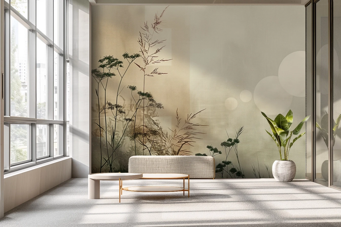
Perspective wallpapers – depth illusion
Designs utilizing perspective are among the strongest tools for optically enlarging a room. Converging lines, horizons, and layered planes are naturally interpreted by the brain as space.
Landscapes and open motifs
The best results come from patterns suggesting distance: pathways leading into the distance, landscapes with clear horizons, and gently blurred distant plans. The less literal and sharp edges, the easier the pattern blends with the interior. In RÊVE wallpapers, perspective is often suggested rather than directly depicted.
3D effect wallpapers
3D motifs should be used sparingly, preferably on one selected wall. In this role, they can effectively deepen the space without causing chaos or sensory overload.
Color as a distance regulator
The color of the wallpaper not only affects the brightness of the room but also influences the perception of distance. Light, subdued colors are perceived as more distant, making the wall appear less massive. Whites and their derivatives, light beiges and sandy shades, diluted grays, and soft pastels work best.
Excessive dark and intense colors visually "bring closer" the wall, so in RÊVE projects, they usually appear as controlled accents rather than dominant features.
Gloss and texture – a detail that matters
Matte surfaces stabilize the color and react calmly to changes in light. As a result, the wall remains calm and visually coherent.
Subtle gloss works differently – it disperses light and can subtly enhance the sense of depth, especially in rooms with limited access to natural light. The key is the moderate intensity of the effect.
One wall instead of all
In small interiors, the safest solution is to apply a pattern to one surface. This allows for control over proportions, avoids visual overload, and focuses attention on one point.
The wallpapered wall then becomes a space-organizing background rather than a dominant element.
A pattern that enlarges works quietly
Room-enlarging wallpapers do not rely on a "wow" effect. Their effectiveness comes from harmony: a calm scale, orderly rhythm, gentle tonal transitions, and conscious guidance of the eye.
It is this visual quietness that transforms the wall from a boundary into a space-enhancing element – exactly as the patterns of the wallpaper brand RÊVE are designed.
